STIIM: 투자 인사이트를 시각화한 지도 기반 플랫폼
Services
Web Design
Client
CROSSCHECK
Date
June 2024

Project Overview
STIIM은 분산된 투자 기회를 새로운 시각으로 탐색할 수 있도록 설계된 위치 기반 투자 플랫폼입니다. 지리정보 데이터를 직관적인 사용자 경험(UX)과 결합하여, 사용자가 인터랙티브 지도 인터페이스를 통해 직접 투자 상품을 탐색할 수 있도록 합니다.
이를 통해 STIIM은 복잡한 금융 데이터를 시각적이고 이해하기 쉬운 형태로 단순화하여, 지역적 맥락을 기반으로 한 투자 판단을 돕습니다. 사용자는 지도 위에서 투자 흐름과 기회를 한눈에 파악하며, 기존의 수동적 투자 경험을 보다 현실적이고 몰입적인 경험으로 전환할 수 있습니다.
Project Highlights
Goal
STIIM의 목표는 단순히 투자 상품을 나열하는 플랫폼을 만드는 것이 아니라, 데이터와 공간의 관계를 통해 새로운 투자 경험을 설계하는 것이었습니다. 복잡한 수치나 지표에 의존하지 않고, 지도 위에서 직관적으로 투자 흐름을 탐색하고 지역적 맥락 속에서 의미를 발견할 수 있도록 하는 것이 핵심 방향이었습니다.투자 데이터를 단순히 확인하는 단계를 넘어 직접 탐색하고, 비교하고, 전략적으로 판단하는 능동적 투자 경험으로 확장시키고자 했습니다.
Outcome
기존 투자 플랫폼은 수치 중심의 인터페이스로 인해 정보가 단편적으로 제시되어, 사용자가 투자 기회의 실제적 의미나 지역적 흐름을 파악하기 어려운 한계가 있었습니다. STIIM은 이러한 문제를 해결하기 위해 금융 데이터와 지리정보의 연결 구조, 그리고 시각적 인사이트를 제공하는 UX 패턴을 새롭게 정의해야 했습니다.
Challenge
STIIM은 지도 위에서 투자 데이터를 탐색할 수 있는 인터랙티브 인사이트 맵을 구축하여, 투자자들이 복잡한 데이터를 시각적으로 이해하고, 공간적 관점에서 투자 결정을 내릴 수 있는 경험을 제공합니다.이를 통해 사용자는 수동적 정보 소비자가 아닌, 탐색하고 해석하는 능동적 투자자로 전환되는 새로운 투자 여정을 경험합니다.

Project Timeline

Layout
STIIM은 HTML5 시맨틱 레이아웃을 적용하여 콘텐츠의 역할을 명확히 구분하고, 사용자 경험과 유지보수성을 동시에 강화했습니다. 리스트 화면은 Header–Content–Aside 구조를 기반으로 설계되어, 투자 카드 목록과 실시간 지도를 결합한 인터페이스를 제공합니다. 또한 자산 대시보드 화면은 탐색을 위한 패널 과 사용자 투자 데이터를 시각적으로 표현하는 콘텐츠 영역으로 구성되어, 데이터를 명확하고 반응형으로 표시함으로써 직관적인 투자 현황 파악이 가능하도록 설계되었습니다.

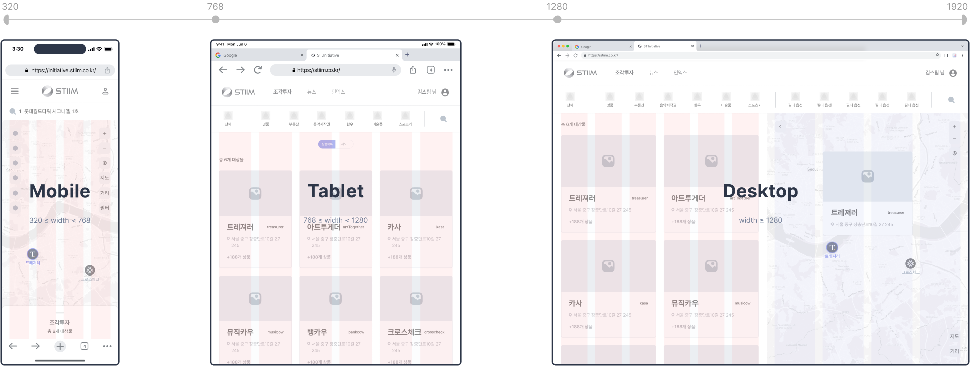
Devices & Grids
STIIM은 모바일, 태블릿, 데스크톱 환경에 따라 동적으로 콘텐츠 레이아웃을 조정하는 반응형 시스템을 적용했습니다. 모바일에서는 단일 컬럼 레이아웃을 사용하여 내비게이션을 단순화하고, 태블릿에서는 8컬럼 카드 기반 레이아웃을 통해 콘텐츠 밀도와 가독성의 균형을 유지했습니다. 데스크톱 환경에서는 12컬럼 구조를 적용하여 리스트와 지도 뷰를 동시에 표시할 수 있도록 하였으며, 이를 통해 화면 공간 활용 효율성과 사용자 경험의 완성도를 높였습니다.
UI Wireframe
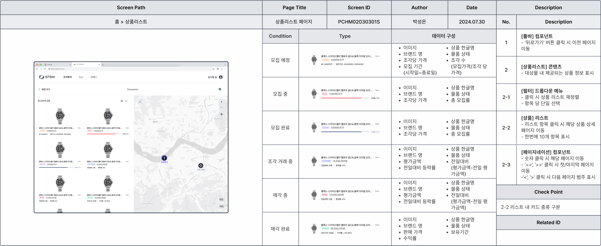
사용자가 다양한 조각 투자 상품을 탐색할 수 있도록 설계된 상품 리스트 페이지의 구조를 보여줍니다. 좌측 영역에는 자산 상태(‘분양 예정’부터 ‘거래 완료’까지)에 따라 정리된 투자 카드 목록이 배치되어 있으며, 각 카드는 투자 단계별 맥락적 데이터를 제공합니다. 우측 영역에는 지도가 함께 구성되어 있어, 사용자가 자산의 지리적 위치와 분포를 시각적으로 인식하고 공간적 맥락에 기반한 투자 판단을 내릴 수 있도록 지원합니다.
QA Check-list
STIIM QA 체크리스트는 단순한 기능 검증에 그치지 않고, UI 일관성, 데이터 정확성, 인터랙션 신뢰성까지 종합적으로 검증할 수 있도록 설계되었습니다. 조각 투자 도메인의 상품 리스트 페이지를 중심으로, 필터 인터랙션, 뒤로가기 동작, 툴팁 노출 동작, 아이템 개수 및 상태 표시 등 세부 기능에 대한 테스트 케이스가 포함되어 있습니다. 각 케이스는 요구사항 유형(SIR, TER, DAR 등) 에 따라 분류되어 있으며, 이를 통해 디자인 구현, 데이터 무결성, 컴포넌트 로직 전반에 걸친 정확한 검증이 이루어지도록 구성되었습니다.
