KIMUSUSHI
Project Description
Crafting Brand Perception Through Strategic Identity Design
Project Type
Branding
Deliverables
Brand Proposal

Goal
Challenge
Outcome
KIMUSUSHI is a sushi brand crafted by artisans, aiming to deliver the finest taste to consumers. The brand seeks to reinterpret their passion and dedication through a modern visual language while developing consistently applicable design assets to enhance its competitiveness.
I sought to introduce new and sophisticated design elements that align with changing times, bridge the gap between the brand’s intended message and the image perceived by customers and stakeholders, and focus on designing a consistent brand system with scalability and flexibility.
The final deliverables included a detailed logo guide encompassing usage guidelines and color palettes, which enhanced brand consistency and successfully increased recognition and trust among key stakeholders.
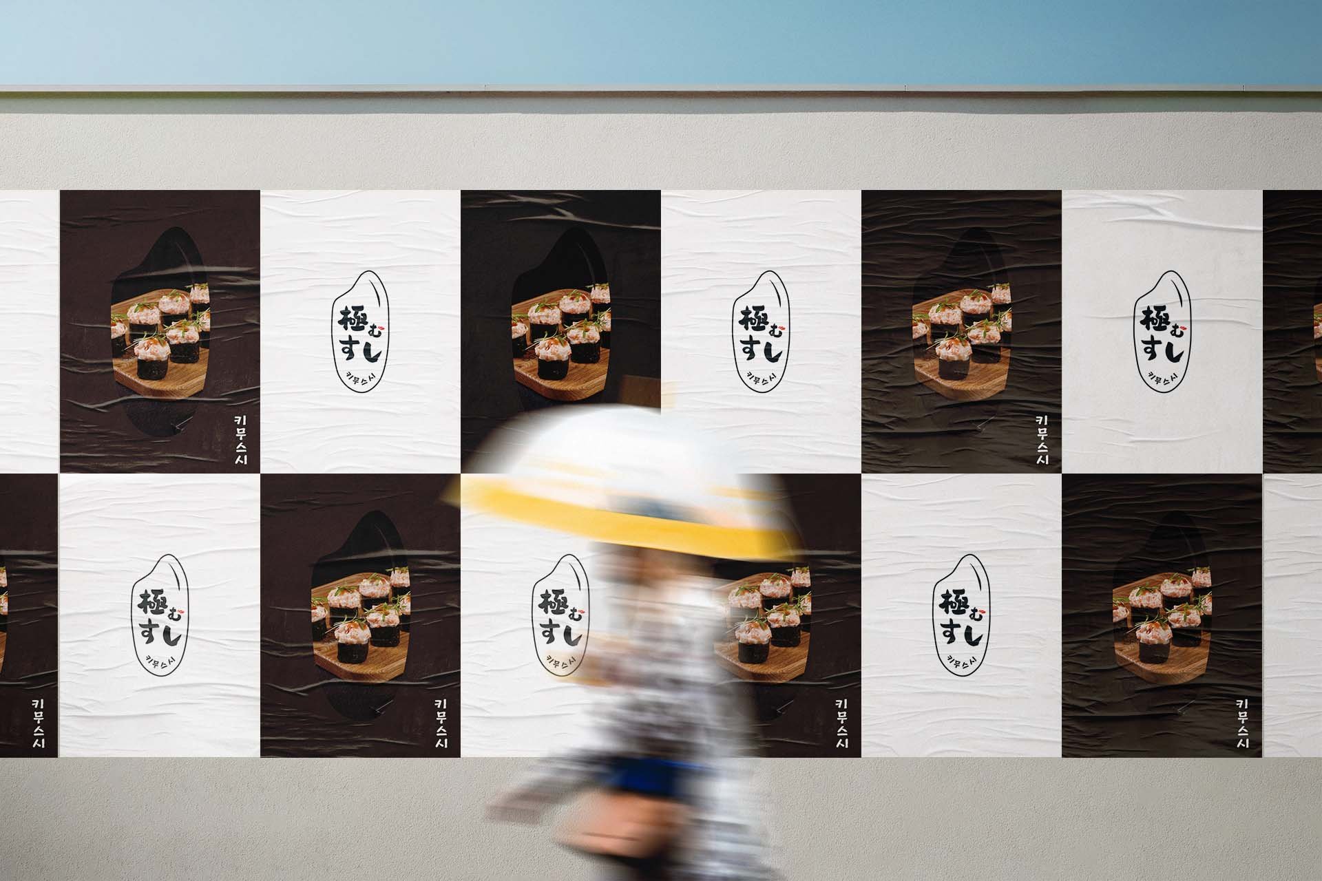
Brand Logo & Symbol
KIMU(極む) embodies a brand philosophy of pursuing the essence of natural flavors, reflected in the KIMUSUSHI logo, which uses a rice grain-inspired brush font to convey an oriental brand image and highlight its unique rice formula as a key differentiator achieved through dedicated research and innovation.


Brand Color & Material
KIMUSUSHI's colors and materials are found in the various components of sushi. It expresses a smooth and sensual brand image through soft and warm colors.


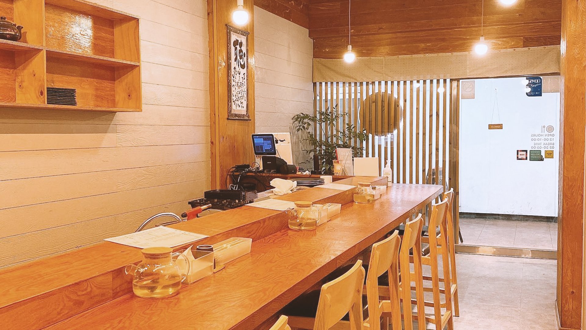
Brand Experience Design
Based on the minimal feeling, KIMUSUSHI's logotype, color, and graphics are used as various design elements to apply to brand applications so customers can feel KIMUSUSHI's unique image at all experience points.