Tablet-Branch: 태블릿 기반의 차세대 은행 창구 플랫폼
Services
App Design
Client
KB Financial Group
Date
October 2022
Project Overview
Tablet-Branch는 은행 창구 환경의 디지털 전환을 목표로, 상담원용 태블릿을 중심으로 한 차세대 영업점 운영 플랫폼입니다.
창구 업무의 복잡한 절차를 단순화하고, 고객 상담부터 상품 가입까지의 프로세스를 하나의 태블릿 환경에서 처리할 수 있도록 UX를 재설계했습니다.
이를 통해 상담 효율성과 고객 경험을 동시에 개선하고, 대면 서비스의 한계를 보완하는 하이브리드 금융 창구 경험을 구축했습니다.
Project Highlights
Goal
본 프로젝트의 목표는 은행 창구 직원들이 수행하는 다양한 역할과 복잡한 금융 업무를 하나의 태블릿 환경에서 직관적으로 처리할 수 있도록, 업무 효율성과 고객 응대 품질을 동시에 향상시키는 사용자 중심 인터페이스를 설계하는 것이었습니다. 단순한 화면 개선을 넘어, 고객 상담 · 상품 제안 · 전자서명 · 서류 확인 등 전 과정을 유기적으로 연결하는 경험 설계를 통해 지점의 디지털 전환을 실질적으로 가속화하는 것을 목표로 했습니다.
Outcome
은행 창구는 보안, 컴플라이언스, 업무 절차 등 다양한 제약이 존재하는 복잡한 환경이었습니다. 특히 기존 시스템은 다수의 서류와 화면으로 분산되어 있어 상담원의 업무 집중도와 고객의 체감 경험 모두 낮은 상태였습니다. 이에 따라, 태블릿 환경에서 업무 효율을 높이면서도 직원의 숙련도나 역할(예: 창구 상담, 대출 심사, VIP 관리)에 따라 각기 다른 정보 우선순위를 반영해야 했기에 역할 기반 UI 전략 수립이 핵심 과제로 설정되었습니다.
Challenge
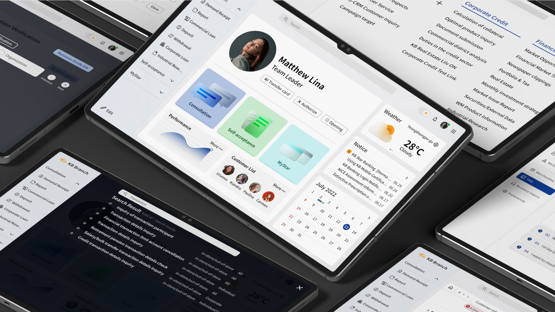
Tablet-Branch를 통해 은행 창구의 핵심 프로세스가 하나의 태블릿 화면으로 통합되었으며, 상담원은 고객 정보 · 상품 비교 · 전자서명 · 업무 확인을 한 흐름 안에서 처리할 수 있게 되었습니다.
UI 가이드라인과 8-column 반응형 그리드 시스템을 적용하여, 지점 내 다양한 디바이스 환경에서도 일관된 사용성을 확보했습니다.
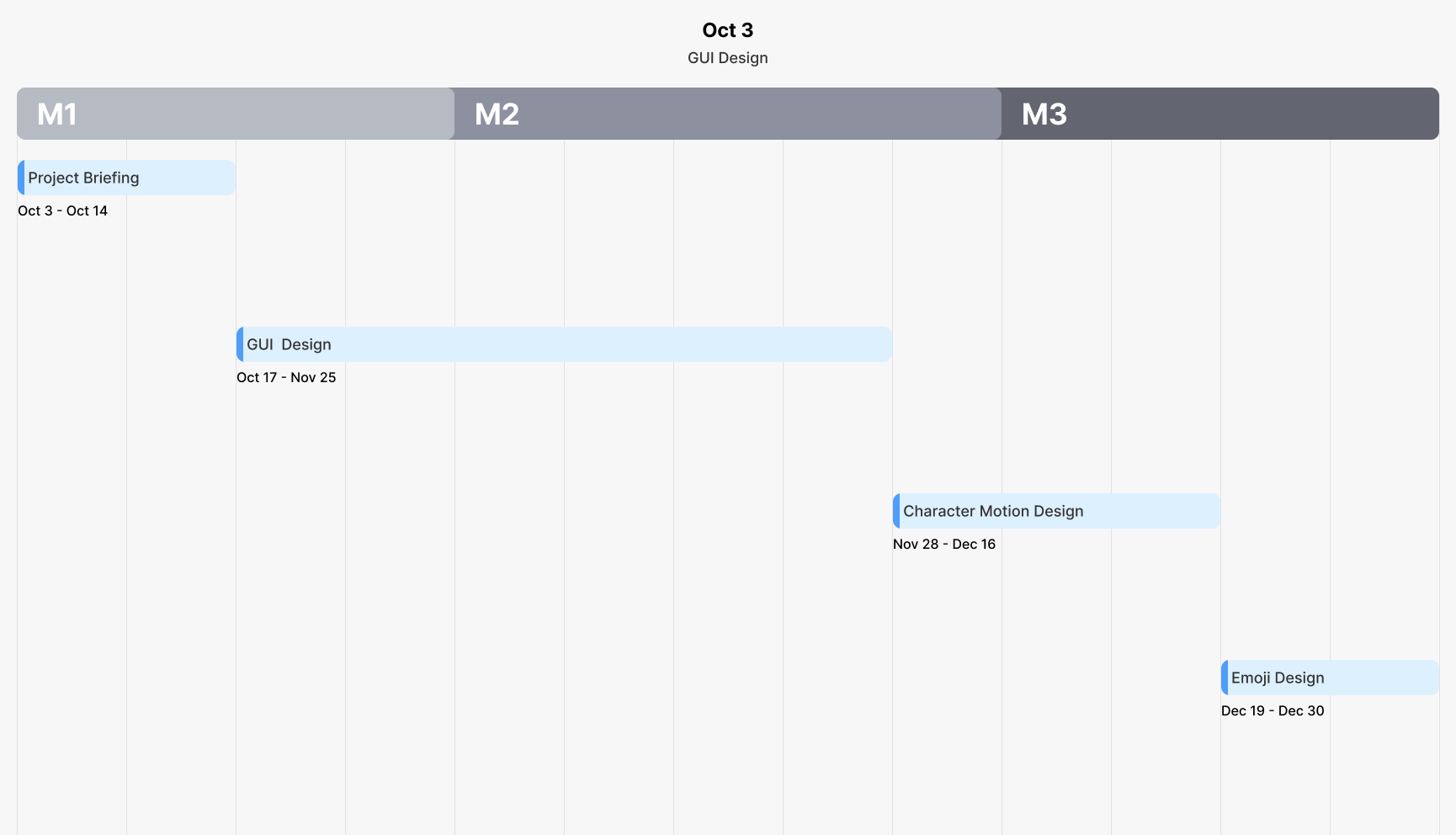
Project Timeline
Wireframe (As-is)
이전 인터페이스 디자인의 와이어프레임을 분석한 결과, 화면 하단의 과도한 여백으로 인해 핵심 정보와 인터랙티브 요소들이 중앙에 과도하게 집중되어 있음을 확인했습니다. 이러한 불균형한 레이아웃은 사용자의 자연스러운 작업 흐름을 방해하여, 업무 효율성과 전체적인 인터페이스 사용성을 저하시켰습니다.

Wireframe (To-be)
와이어프레임 개선 과정에서는 사용자와 가장 밀접한 주요 콘텐츠를 화면 중앙에 배치하고, 보조 콘텐츠를 그 주변에 균형 있게 배치하여 공간 활용 효율을 극대화했습니다. 이러한 디자인 접근 방식은 주요 업무의 시각적 초점을 명확히 하면서, 보조 기능과 정보를 자연스럽게 통합하여 전체 화면 흐름과 사용성을 크게 향상시켰습니다.

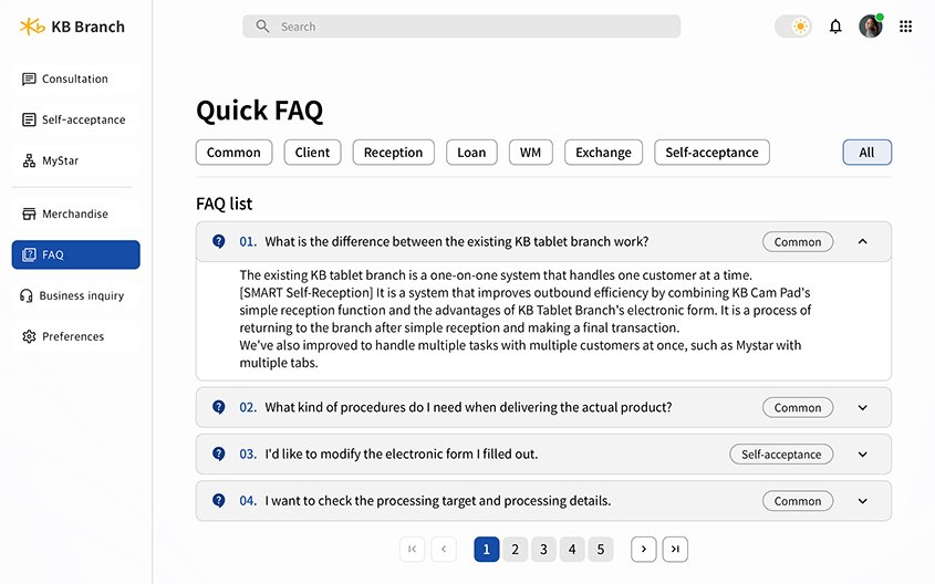
GUI Design


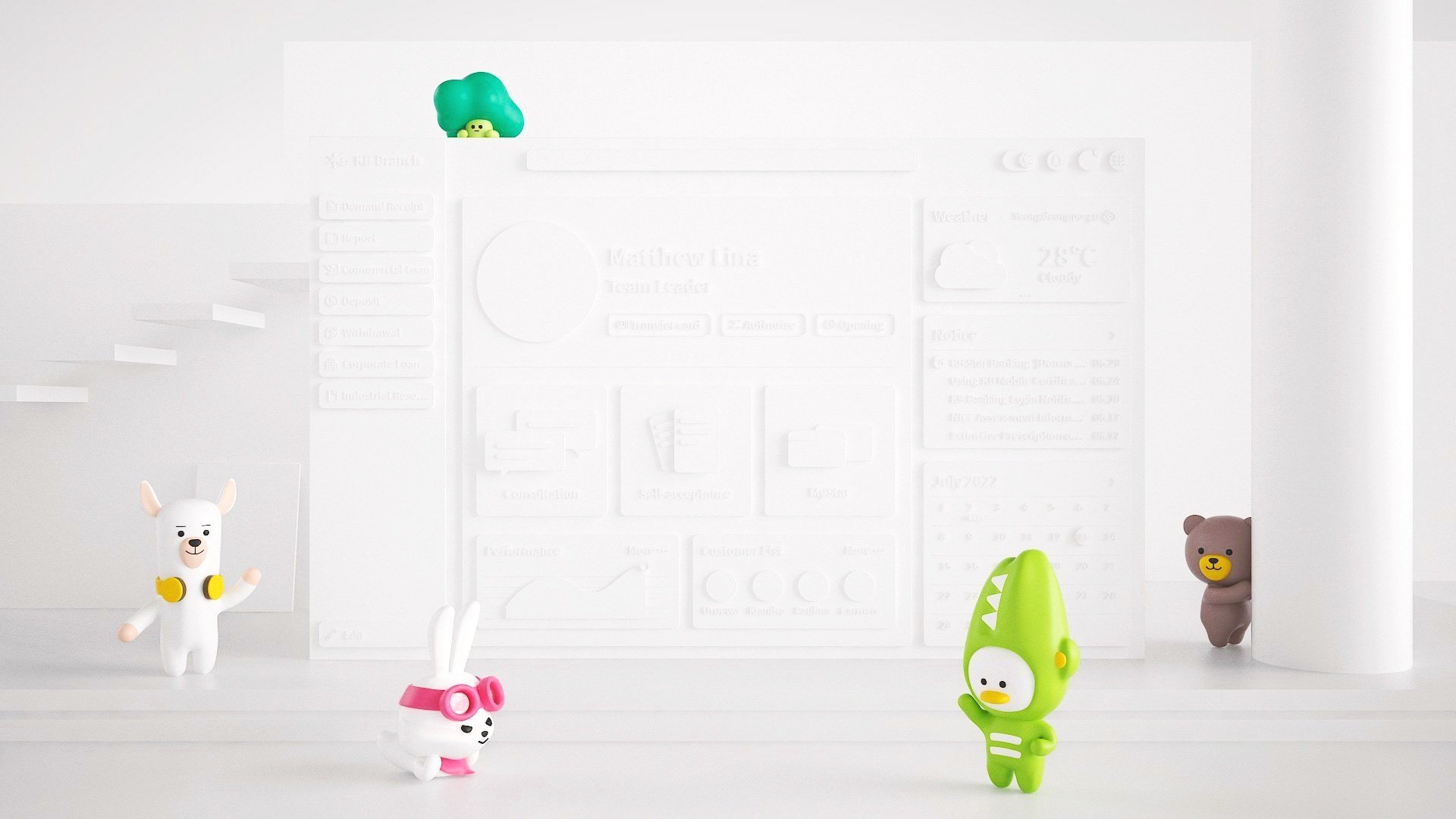
Virtual Assistant
브랜드 캐릭터의 3D 디자인은 단순한 시각적 요소를 넘어, 사용자와의 감성적 연결을 매개하는 가상 어시스턴트로 소프트웨어 전반에 통합되었습니다. 이 캐릭터는 업무 과정 속에서 직관적인 피드백과 유연한 인터랙션을 제공하여 사용자가 시스템을 보다 자연스럽게 탐색하고 이해할 수 있도록 돕습니다. 결과적으로 이 3D 캐릭터는 단순한 디자인 요소를 넘어 브랜드 경험과 사용자 몰입도를 동시에 향상시키는 핵심 매개체로 작용했습니다.
