QUANTUMDATA
Project Description
Establishing a Precise Guide for the Company's Logo
Project Type
Branding
Deliverables
CI Design Guideline

Goal
Challenge
Outcome
The goal is to refine the QUANTUMDATA logo and create a comprehensive brand identity guide that ensures consistency across all touchpoints, building a cohesive and visually impactful corporate image.
We sought to maintain the existing logo's brand identity while incorporating the latest design trends and addressing inconsistencies in logo usage across various platforms and materials.
The final deliverables were a refined logo guide encompassing logo usage, color palettes, typography, and spacing rules. This improved brand consistency and successfully enhanced recognition and trust among key stakeholders.
1
Months of collab
1
Deliverables
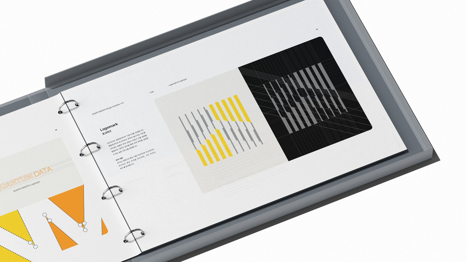
Logomark
The logomark represents the corporate values of QUANTUMDATA. It combines the shape of candlesticks, symbolizing essential investment indicators, with the form of real estate buildings, a symbol of wealth. This fusion embodies QUANTUMDATA's mission to deliver data-driven services that enable wealth accumulation.

Logotype
The logotype's details were meticulously refined to express the brand's core values in a modern and sophisticated manner. A comprehensive usage guide was created, including specifications for size, spacing, color usage, and prohibited applications, ensuring consistent and effective use across various environments while enhancing the brand's identity and professionalism.

Logo Clear Space
To maximize the readability and visual distinctiveness of the logo, clear space rules were meticulously established, detailing the minimum padding requirements around the logo. A comprehensive guide was created to ensure consistent and professional logo application across various environments, including digital and print media.
Brand Palette
QUANTUMDATA's primary brand colors are Rubber_Duck Yellow, Davy Grey, and Mountain Mist, representing the brand's identity and philosophy. ArtyClick Orange, Desert White, White, and Black are used as secondary colors. Phtalo Blue is occasionally utilized as an accent color in layout elements to enhance visibility.

Brand Gradient
Gradients add depth to the design. QUANTUMDATA's gradient palette includes four options: Cloud, Mango, Ocean, and Glow. These gradient colors combine QUANTUMDATA's core colors and are designed to work seamlessly across both light and dark themes.

Font Hierarchy
Using the Pretendard font, layouts were designed with carefully adjusted font weights and scales to establish a clear typographic hierarchy. This approach emphasized key messages and effectively conveyed the flow and importance of information. The hierarchy significantly contributed to maximizing readability and visual harmony across both digital and print environments.

Font Styling
Text is primarily left-aligned, with center and right alignment reserved for specific use cases such as headlines or advertisements. Letter spacing and line height are carefully adjusted according to hierarchy, emphasizing key information while ensuring long text is easy to read. This design approach enhances both visual harmony and clarity in information delivery.

Grid Construction
Based on a modular spacing structure, text hierarchy and logo placement rules were meticulously designed to maintain visual harmony and proportionality across all layouts. This grid system, adaptable to various formats and sizes, was developed as a comprehensive guide to simultaneously enhance readability and design consistency.

Layout
To achieve a harmonious arrangement of text and images, the rules established on the previous page were consistently applied. Images were designed to occupy up to two-thirds of the entire layout, depending on the layout size. Additionally, the spacing between text and images was adjusted according to the guidelines to maintain visual balance and clarity of information.

Data Visualization
A data visualization guide was developed to simplify the complexity of data visually and effectively communicate key information. The guide incorporates a clear hierarchy, a brand-consistent color palette, intuitive chart types, and user-centered design principles. This approach maximizes the readability and impact of information while reinforcing brand identity and accessibility, enhancing reliability and professionalism across diverse application environments.